3 Reasons Why the WCAG 2.1 Color Contrast Guidelines Don't Work
But there's still hope with the upcoming WCAG 3 candidate: APCA

I am a developer with an affinity for creative technologies. I believe AI and XR will be the new reality of the future and I want to be a major part in building it!
WCAG 2.x contrast guidelines, accompanied by their related understandings and regulations, have been around since a time prior to the inception of smartphones and iPads, when CRT displays reigned supreme and web fonts had just begun to be widely used. Fast forward 15 years and the contrast rules, although invaluable in the past, need a significant makeover to keep up with the technological advancements, such as the change in computer screens, website content, and the leaps in vision science since WCAG 2.x first came out in 2005/2008.
TLDR;
Check out this tweet thread for a summary
Why are color and contrast even important?
But what even is color?
As a start, it may seem strange to think that color isn't real - but it's true. The visible light range is simply a variety of frequencies and wavelengths, not unlike how the keys on a piano produce distinct sounds. The human eye is able to detect three main bands of light, which the light-sensitive cones in the eye can distinguish as long (L), medium (M), and short (S) wavelengths.
We normally associate the cone sensitivity of L, M, or S with red, green, and blue colors, which we know as the three primary colors of light. Specific red, green, and blue hues are used for the "color primaries" used in an RGB additive color model. The sRGB colorspace, the default standard colorspace for web content, is an example of an additive RGB color model.
There are other color models like CMYK which is a subtractive color model but we won't go into those specifics in this blog post. For curious minds who want to learn more about how our eyes and the human visual system function, you can check this detailed post.
Color and contrast perception
It's important to understand that our perception of color, light, and contrast is :
a perception that depends on context
not absolute
mostly based on human neurology
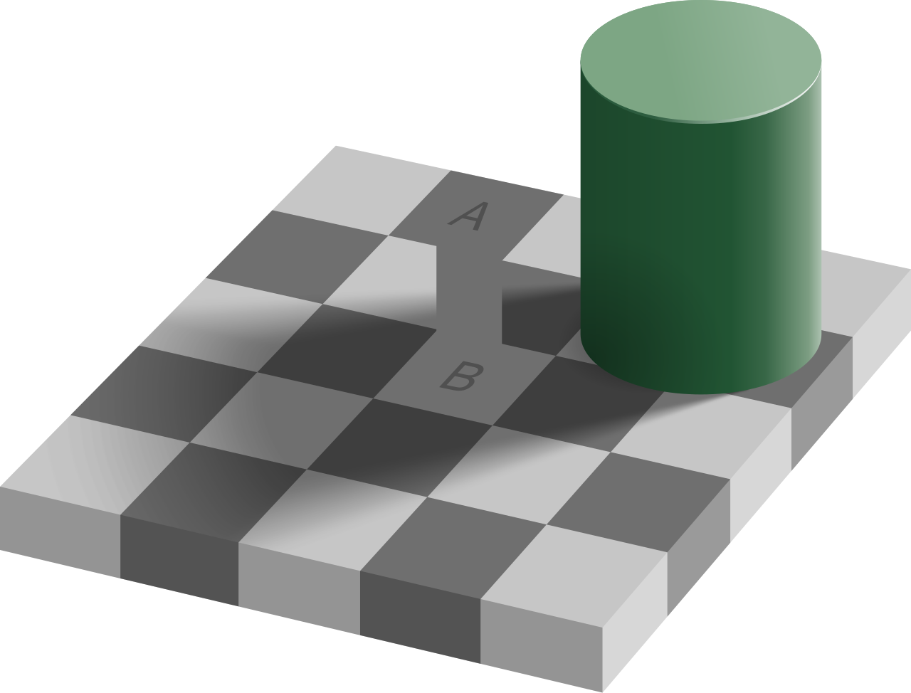
Check out this classic Checker Shadow 'illusion' which tricks our perception to make us feel like there are two different and distinct colors when indeed it's the same.

Square A here appears to be a darker shade than square B, although they have the exact same luminance! Don't believe me, check the below image now:
The current guidelines are faulty
Despite WCAG 2.x's contrast standards, there are a variety of reasons why the pass/fail binary structure of its success criteria may not be suitable, especially for properties that are not binary across all perceptual and disability conditions. Humans are not machines, so it's essential to comprehend the complexities of perception and implement guidelines that reflect it, rather than resorting to rigid, ineffective values.
Contrast is an illusion created by the mind - not a physical measurement - as our brains interpret the visual difference between colors. Influenced by context, spatial frequency and lightness perception, what may appear as a vast difference to one person could be a subtle variation to another. So much more than a numerical calculation, contrast is an intricate trick of the eye.
One point which we generally miss out on, and even the current WCAG guidelines do not consider is the effect of font and font sizes on perceived contrast. Once a certain contrast level is reached, further increases in the contrast ratio won't result in higher readability. A high spatial frequency means smaller and thinner letters, which can lessen the contrast. To combat this, the difference between the text and background color must be upped to make up for the small size of the font.
This brings us to the first issue: Current guidelines do not take into account, the effect that font and font sizes have on perceived contrast.
Next, as mentioned above already, color contrast is not actually "real" and is a complex human science that depends on the context and various neurological factors. Considering this, we can say that the current guidelines fail because a strict pass/fail with a blanket contrast ratio is not instructive as a guideline, and does not necessarily solve a given user need. In fact, user needs when it comes to contrast are conflicting—what is good for one can be harmful to another. This is even true of the font size.
This points to the importance of real user personalization, an area where the technology is missing (and a work in progress). For the guidelines though, we can set ranges for targets and expectations toward making the web readable for all.
The 3rd reason I can think of is that by swapping text and background colors, the accessibility result as per WCAG 2.x is the same.
Welcome APCA: Accessible Perceptual Contrast Algorithm!
It's still in progress and hasn't been finalized yet, but the advancements are interesting, to say the least. They are a good foot forward in making the web more readable and accessible.
The APCA which is perceptually uniform, generates a lightness/darkness contrast value based on a font size and color pair, with Lc 60 representing the same perceptible readability contrast regardless of how light or dark the colors are. However, when it comes to WCAG 2.x, this can be significantly different; the contrast ratio can be so great (4.5:1) that using a color close to black can make it functionally unreadable. Consequently, WCAG 2.x contrast should not be taken into account when designing 'dark mode'.
Use case and size ranges
These general levels are appropriate for use by themselves, without the need to reference a lookup table. APCA reports contrast as an Lc value (lightness contrast) from Lc 0 to Lc 105+. For accessibility, consider Lc 15 as the point of invisibility for many users, and Lc 90 is preferred for body text.
Lc 90 - Preferred level for fluent text and columns of body text with a font no smaller than 18px/weight 300 or 14px/weight 400 (normal), or non-body text with a font no smaller than 12px/400. Also a recommended minimum for extremely thin fonts with a minimum of 24px at weight 200. Lc 90 is a suggested maximum for very large and bold fonts (greater than 36px bold), and large areas of color. Small fonts do not have a maximum.
Lc 75 - The minimum level for columns of body text with a font no smaller than 24px/300 weight, 18px/400, 16px/500 and 14px/700. This level may be used with non-body text with a font no smaller than 15px/400. Also, Lc 75 should be considered a minimum for larger for any larger text where readability is important.
Lc 60 - The minimum level recommended for content text that is not body, column, or block text. In other words, text you want people to read. The minimums: no smaller than 48px/200, 36px/300, 24px normal weight (400), 21px/500, 18px/600, 16px/700 (bold). These values based on the reference font Helvetica. To use these sizes as body text, add Lc 15.
Lc 45 - The minimum for larger, heavier text (36px normal weight or 24px bold) such as headlines, and large text that should be fluently readable but is not body text. This is also the minimum for pictograms with fine details, or smaller outline icons.
Lc 30 - The absolute minimum for any text not listed above, including text considered as “spot readable”. This includes placeholder text and disabled element text, and some non-content like a copyright bug. This is also the minimum for large/solid semantic & understandable non-text elements such as “mostly solid” icons or pictograms. Generally no less than 4px solid in its smallest dimension.
Lc 15 - The absolute minimum for any non-text that needs to be discernible, and is no less than 6px (solid) in its smallest dimension. This may include dividers, and in some cases large buttons or thick focus visible outlines, but does not include fine details which have a higher minimum. Designers should treat anything below this level as invisible, as it will not be visible to many users. This minimum level should be avoided for any items important to the use, understanding, or interaction of the site.
In conclusion
WCAG 3 is still in the process of being developed and it offers a range-based conformance system that considers multiple factors yet is still simple enough to be fully automated, foregoing the outdated pass/fail binary system. This makes for improved readability and design flexibility; contrast levels are amplified where body text needs it most and softened where large, non-text elements are present, as their greater size already delivers a lower spatial frequency.
P.S.
You can check this sweet little tool to check for color contrast and even get suggestions for a complementary color with great contrast, given a text or background color, which I built using the APCA:
P.S. 2
Credit to Myndex for their amazing work in proposing this new algorithm. You can learn more about APCA here. Also, this article by them in MDN is a great resource to learn more about colors and contrast in general.